getting better at css
author: brody kingpublished: 04.13.2025
while i am still using bootstrap, i have gotten better at customizing it. i wrote about the struggles here.
here is pouchtrack's landing page before (v5.0) and after (v5.3)
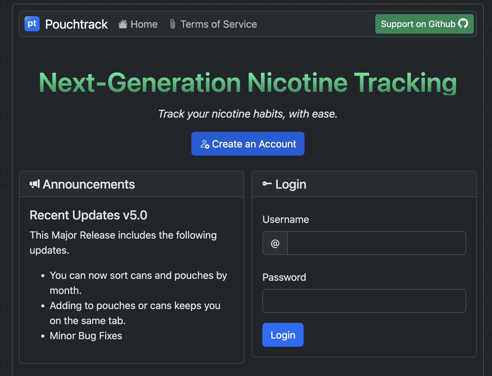
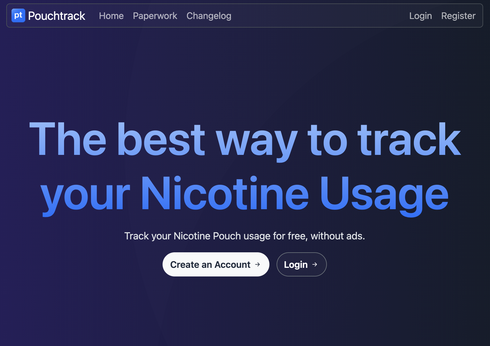
i took a lot of the inspiration from create t3 app. didnt steal any actual css, but tried to replicate the design.
the buttons are done like so
.btn-primary-new {
    border-radius: 2rem;
    background-color: rgb(248, 249, 250);
    padding-top: 0.5rem!important;
    padding-bottom: 0.5rem!important;
    font-weight: 600 !important;
    color: #1e293b;
}

.btn-primary-new:hover {
    color: #1e293b;
    background-color: rgb(206, 206, 206);
}

.btn-secondary-new {
    border-radius: 2rem;
    background-color: #dee2e608!important;
    padding-top: 0.5rem!important;
    padding-bottom: 0.5rem!important;
    font-weight: 600 !important;
    color: white;
    border: 1px solid #6c757d;
}

.btn-secondary-new:hover {
    color: white;
    background-color: rgba(230, 230, 230, 0.2)!important;
    border: 1px solid #6c757d;
}
the only issue with my current design is that a light/dark mode would be almost impossible. but honestly, i have no plans on adding a light mode. light mode is garbage and it was annoying enough on this site.
anyways, just wanted to share a little insight into how i did these customizations. have a good day